WHAT COLOR IS KAMEN RIDER BIRTH?
look, you're the one who clicked on this, you gotta trust me that i'm going somewhere with it.
it's that lovely time of year again, where i realize summer is barreling towards us, because we're on the cusp of a new season of Kamen Rider. as of this writing, we haven't been properly introduced to the inscrutably named Zeztz, but the increasingly fractured corners of the online tokusatsu rumor mill are once again buzzing with news of what we might be able to expect. the current word on the street seems to paint our new Rider as a high-tech hero decked out in black, silver, and green, with gashapon goodies powering his belt. my first impression upon hearing this was "high-tech green gashapon Rider? hell yeah, just like Birth, from OOO".
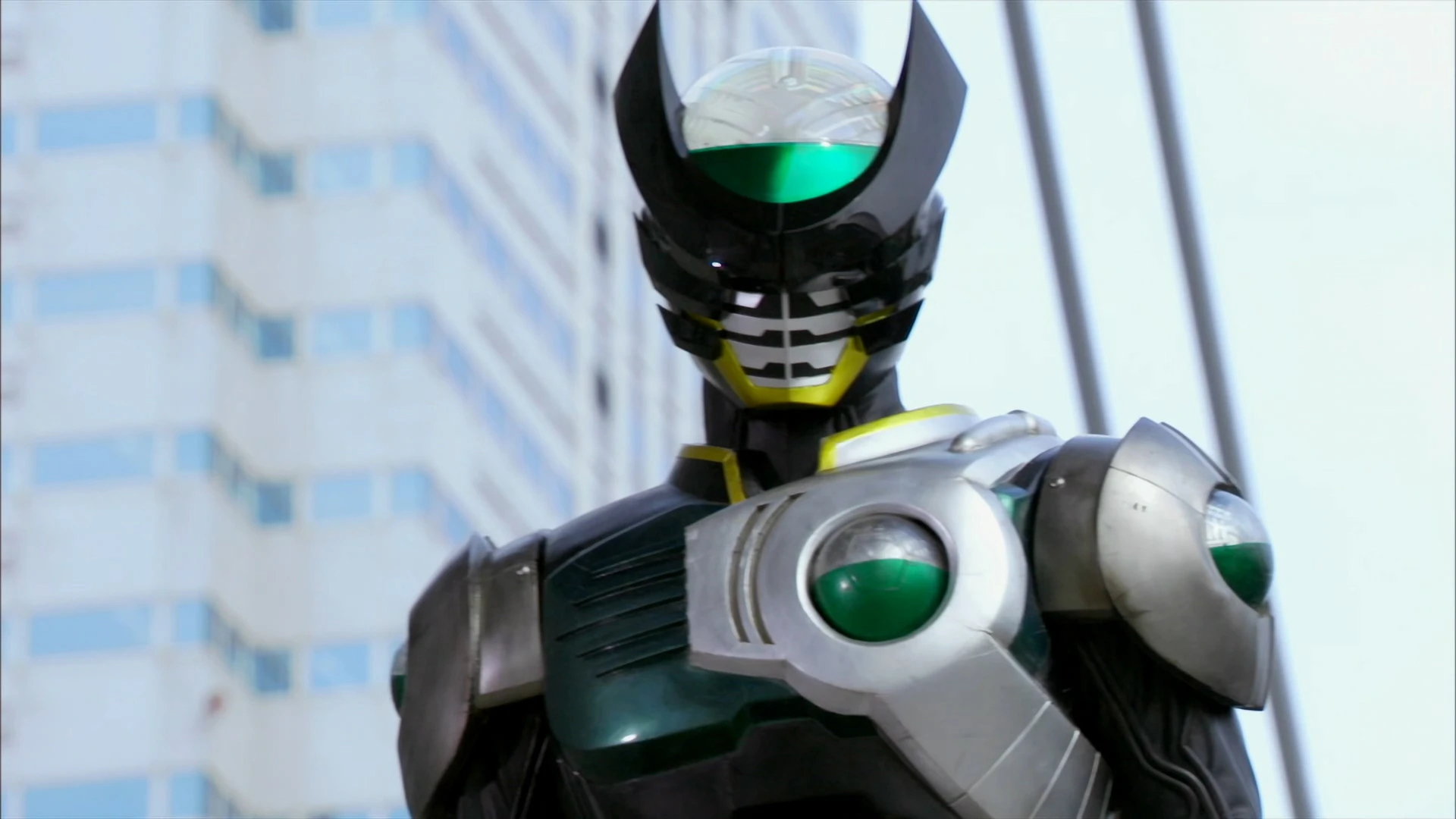
but then, that got me thinking... is Kamen Rider Birth green? is that actually the way i'd describe that suit if i was asked what color that is, outside of this context? i don't think it is, but suddenly, as i was double-checking, i started second-guessing myself. i probably didn't have to get down to the bottom of this, but i know myself well enough to say that yeah, i was going to. what started as jogging my memory solely to prove a point to myself wound up weaving a path through my interests in filmmaking, linguistics, and color theory, and while i can't promise you the information is necessary, i've put too much thought into this and i'm going to double down anyways.
as, i guess, a brief introduction to the concept, since this is the first time it's gotten full-fledged coverage on HYPERFIXT and it's not quite breached the global mainstream; Kamen Rider is a long-running tokusatsu series produced by Toei, created by the absurdly prolific and talented mangaka Shotaro Ishinomori all the way back in 1971. for the purposes of this piece, you don't really need to understand what the show is about (and given its nearly 55-year history and constant yearly reinvention, i couldn't tell you everything even if i wanted to), but it is probably good to have some basic sense of what it is.
tokusatsu - a term that can be translated fairly directly as "special effects" - is a sort of catch-all for Japanese film and television that utilizes practical stuntwork and elaborate suit design to tell larger-than-life stories. if you know Godzilla, you know some tokusatsu. outside of direct imports like that, the concept's largest footprint on Western culture is Power Rangers, which combines the costumed footage from Toei's Super Sentai series with newly filmed American material for when the characters are out of their suits. i mean, sometimes they don't use the Sentai footage, and for almost 20 years the show was actually made in New Zealand, and all of this should be in past tense because the whole thing's in deep freeze right now, but we're just doing the basics here.
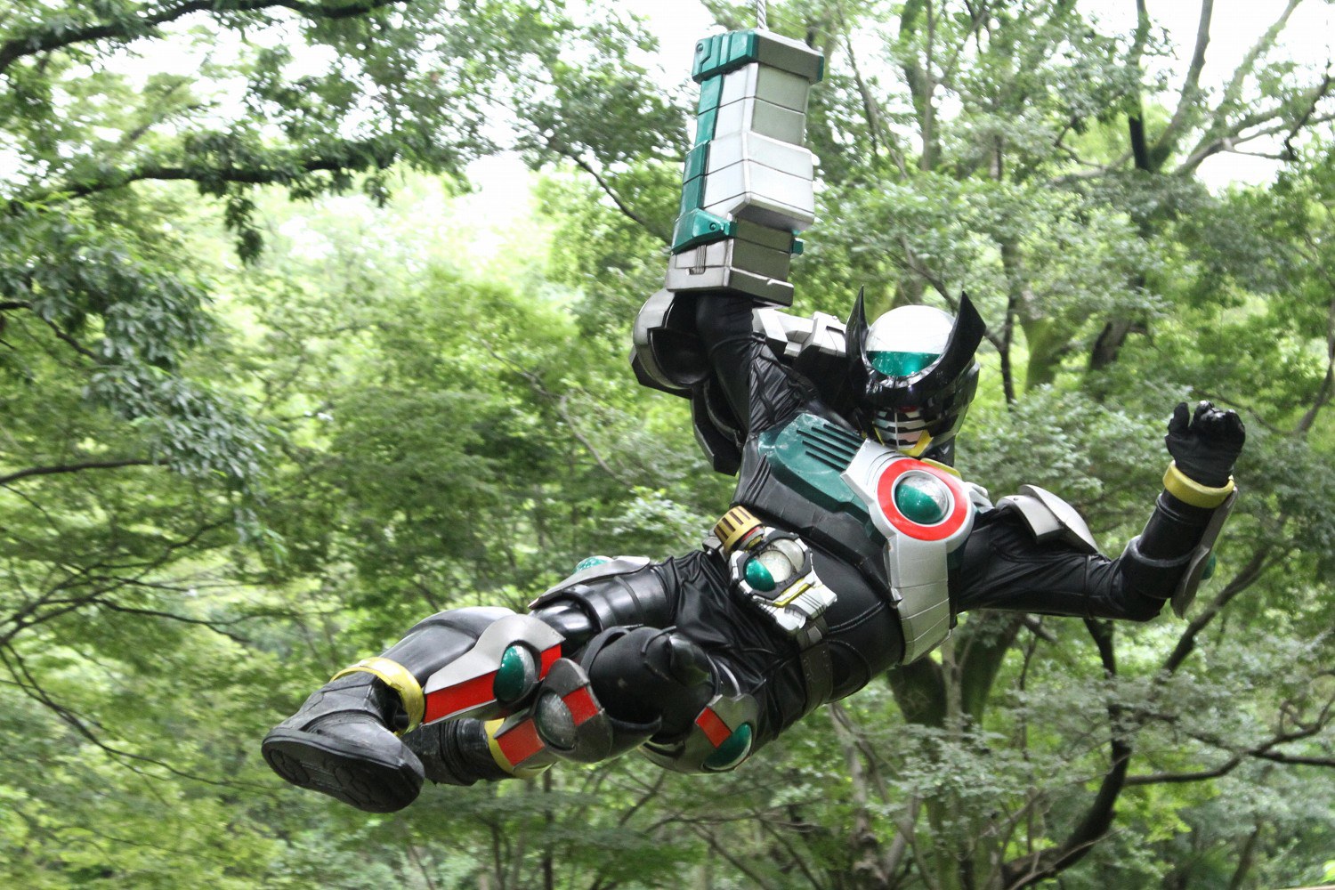
our specific subject for this piece is Kamen Rider Birth, the prerequisite "secondary" Rider introduced to spice up the dynamics and sell a whole new bundle of toyetic devices midway through 2010's Kamen Rider OOO. from a storytelling perspective, Birth is actually one of the relatively rare Riders who's powers are passed between different users over the course of the story, but no matter who's under the mask, we're dealing with the same fundamentals behind the gashapon-themed suit.
obviously, the first step here is to gather a robust set of samples for determining what that accent color really is. as soon as we start collecting reference material, though, we're already going to start running into one of the many factors that made this hunt so fascinating to me. see, you could just say "that's the Kamen Rider Birth suit", but we need to turn off our fiction-consuming brain and turn on our production pipeline brain, because it's never really just one suit. different scenes call for different needs, and any major recurring character like Birth is going to have at least two suits fabricated.
broadly speaking, there are two types of suits that Toei works with PLEX to produce; stunt suits and 'hero' suits. the 'hero' suit is, essentially, the design brought to life with minimal compromises, tailored to avoid things like unsightly zippers or visible eyes peering out from underneath the masks. these suits exist for moments when you want a character in full focus, brought to life through the power of body language and looking their best. of course, that's only half of the equation, as tokusatsu also leans heavily into practical action captured by stunt performers. for these types of scenes, the limited flexibility and low vision of the hero suits becomes a major problem, so a stunt suit is also produced, trading off on detail to instead give the suit actor a wider range of motion and a safer field of vision.
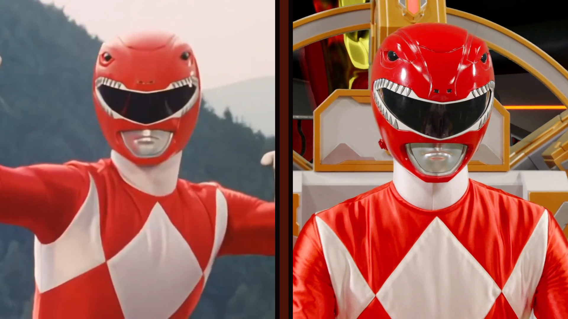
a very visible example i can call upon is the TyrannoRanger suit from Kyoryu Sentai Zyuranger, otherwise known as the original red Power Ranger suit. play close attention to those subtle bumps near the bottom of the helmet in the sample on the right; those are latches holding the whole thing together. on the 'hero' suit, these mechanisms are contained on the inside of the helmet, but the stunt suit puts these clasps on the outside, making it more comfortable to work in during intensive stunts and easier to swap out if you need to, say, fix up some scuffed paint from getting slashed by a monster.
that i can show you an example in relatively high definition is also a demonstration of a sort of 'life cycle' for Toei's tokusatsu suits; the stunt helmet pictured on the right is taken from 2025's No.1 Sentai Gozyuger, an anniversary season that's been bringing back classic Sentai suits as part of its story. once a tokusatsu series is far enough in the rear view mirror, the suits are often scrapped, retooled for something new, or otherwise made unavailable. while manufacturing a new copy of a classic suit up to modern specifications isn't out of the question, it's often the lower quality stunt suit that survives, ready to be used for massive crossovers or outdoor stage shows, or, in this case, brought to television to fill in for its missing 'hero' suit counterpart.
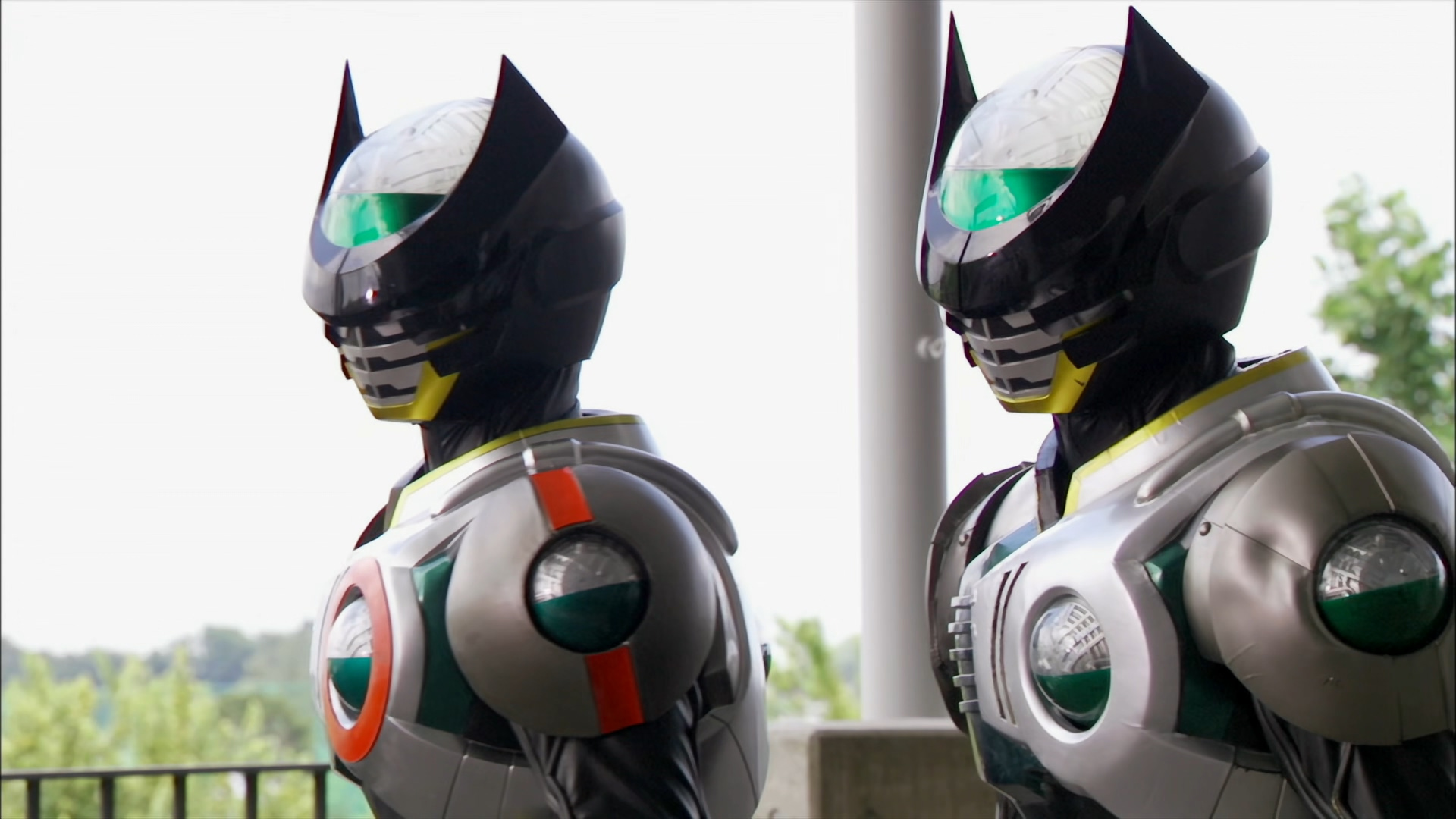
to loop this all back around to our initial subject, this same phenomenon even happened while OOO was still on the air for Kamen Rider Birth. as part of the show's climactic arc, the two primary users of the Birth Driver were able to suit up for battle together for the first time, contextualized within the story by introducing a prototype Birth Driver. the prototype Birth suit, differentiated by its red markings, was brought to life as a practical prop by modifying a stunt suit that'd been used for live events throughout OOO's run. whether it was tweaked to perfection or just that good to begin with, it looks like both Birth suits end up easily matching on-screen; while it may not impact our particular search, this type of behind-the-scenes shuffle is one of the many things that drew me in towards writing all this in the first place. at least for me, spotting the patterns of how these shows are made adds a whole new level of appreciation, both for the practical aspect of designing and acting in these suits, and for the ways the week-to-week story experiences the malleable influence of 'hey, if we can film this type of scene this way, the plot can go in this direction'.
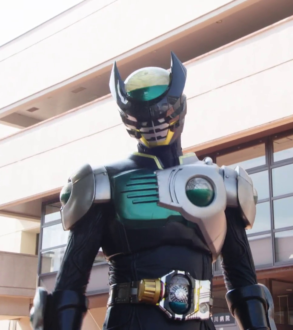
so, now that we've made it through that first set of factors and passed all that comparing and double-checking, the next pitfall to look out for if we're trying to gather reference material is time. any tokusatsu suit, whether it's built for close-quarters combat with a kaijin or striking a perfect henshin pose, is going to experience some amount of wear and tear over the years. for some particularly unlucky Riders, their undersuits have been frayed to the point of getting patched with duct tape,
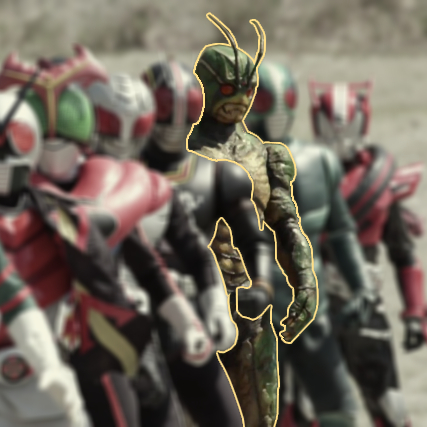
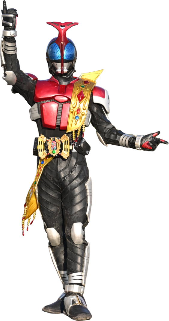 and poor Shin's condition has gotten so bad that he was last seen mounted to a mannequin in the back of a group shot.
 for Birth specifically, though, we have the benefit of extensive reappearances such as OOO's 10th anniversary material to show us how the suit has held up, and we can identify a very specific and common type of damage. like other Riders who utilize layered clear materials to create a shimmering effect, the capsule-shaped section of Birth's helmet has very visibly yellowed, giving it a notable gold tint.
whatever you want to call that accent color, it looks like it's made it through fairly intact, but in the interest of reducing any outside factors like that, i'm going to clamp my search for screenshots to a specific timeframe, ranging from the Birth suit's debut in Movie War Core from December 2010 to its brief appearance in December 2012's Movie War Ultimatum. while seasons of Kamen Rider only last for a year, the end of the season is not necessarily the end of the continuous production pipeline. throughout the 2010s, it was standard practice to have the previous year's Rider cross over with the following season for a theatrical release right before Christmas, and these crossovers often chained together, continuing to pass the torch forward. i don't have access to some kind of internal data that tells me when PLEX stopped doing active upkeep on their Kamen Rider Birth suits, but Movie War Ultimatum marks the last unsuited appearance of OOO himself, Eiji Hino, until several years later. to sum it up; this two-year window extends past Kamen Rider OOO as a television series, but feels about right for Kamen Rider OOO as an 'active' facet of the franchise that would require the suits to be kept in good shape, before they would become relegated to background cameos or special occasions.
so, with the parameters set, i was able to start gathering samples, and there wound up being quite a few! i didn't go frame-by-frame through the show or anything, but by gathering a variety of screencaps, i pulled together 33 different samples; maybe one day i'll repeat the experiment more thoroughly and get back to you, but for something i'm doing on a whim, that feels like the right balance of pulling in a lot of data without getting too deep in the weeds. i was fairly picky about what i brought into the dataset, avoiding things like low-quality scans that created a sort of washed-out palette or any shots that put the suit under especially abnormal lighting conditions. the majority of the images i pulled colors from were either direct shots from the show or, thanks to Toei's 'Kamen Rider Zukan' database, promotional shots taken during the production of OOO.

first, i sampled colors directly from Birth's forehead dome, trying to avoid any major highs or lows created by the suit's metallic finish, and while some of my initial findings skewed much harder onto the far ends of the expected spectrum (with Birth's debut scene in Movie War Core
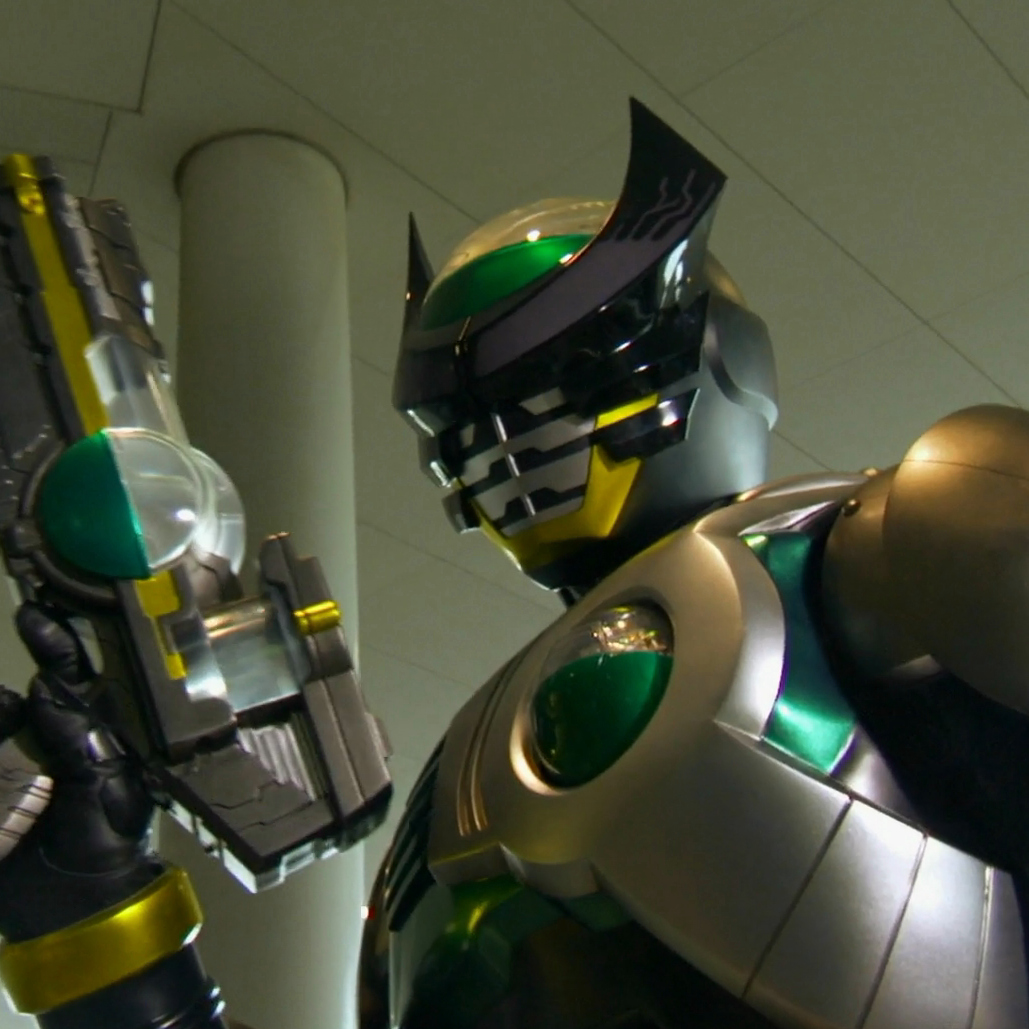 hitting an undeniably green #00a627, thereby allowing me to say "Birth is statistically greenest when he's famed Japanese daimyō Oda Nobunaga" with a straight face), the results do largely reflect whatever color i would describe Birth's accents as being.
as you might be able to see, though, Birth's chestplate (as in the flatter, ridged side opposite to the 'capsule') seems to react to external lighting conditions differently, presumably because it's made of a different material, so i also went ahead and grabbed a chestplate sample off the same set of images; this secondary set is less complete, because some of these shots didn't leave enough visible surface area for me to grab a clean sample from, but it does provide us with a broader frame of reference. i've taken the liberty of including these swatches at the exact resolution i generated them at and overlaid the respective hexcodes on top of each one, so hopefully, regardless of any compression that might have happened along the way, you can test for yourself what each of these colors looks like.
in cases where Birth and Birth Prototype were visible, i sampled both, and it proved conclusively that the two are very closely color-matched; for example, what i would call the bluest sample of Birth's suit comes from 2012's Super Hero Taisen
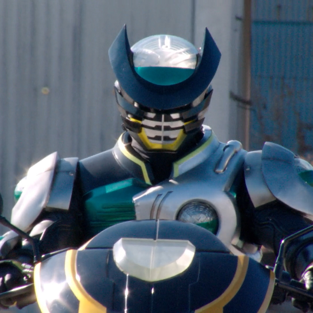 (#036475), and the Birth Prototype suit's hue shifts by an equivalent amount under the same lighting conditions in the same scene
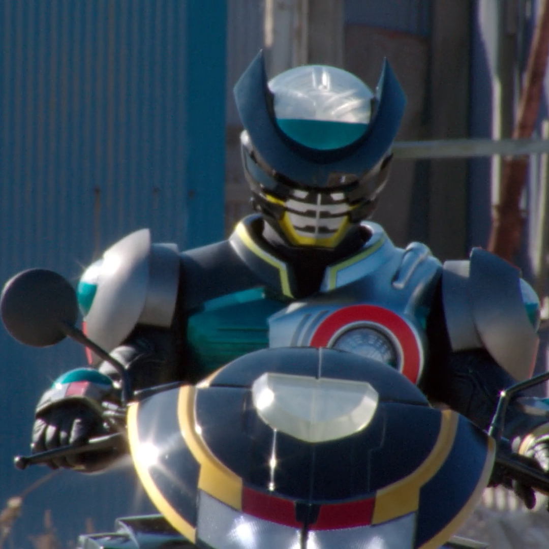 (#00576a). you could argue that if i proved they're close enough to be reasonably called the same color, i could have culled the Prototype samples out of the set, but i prefer to think of it as weighing the average; if Toei puts two copies of the same design on-screen and their colors match well, that helps us produce a stronger baseline of what the suit is supposed to look like.
thankfully, through the magic of photo editing software, i don't just have to talk about a random set of data; i can hit that handy little 'average' button, and it gives us a hexcode of #0f9e7c as the accumulated average of all these dome samples. similarly, averaging out our more limited set of chestplate samples produces a hexcode of #2d675d. this color is notably more muted, but that makes sense based on the individual images, with the metallic chestplate often appearing darker than the gashapon capsules all over Birth's suit. it's less than five degrees off from the dome average when measuring hue on a color wheel, so there's clearly some consistency. within the humble margins of this experiment, Kamen Rider Birth's accent color is scientifically... whatever you would call these colors.
now we're treading into the world of color theory and linguistics, which is part of what i think makes this all... worth doing? 'worth doing' might be a strong way to put it. at the very least, i happen to find it fascinating.
i, personally, would say that the averaged samples have produced a shade of teal. individually within our sample set and as a whole, it's definitely more green than it is blue, but calling our result green without any qualifiers or asterisks feels incorrect; if you disagree, more power to you. part of the fascinating thing about trying to unpack any definitive answer about color is that human vision is subjective, both in a biological sense of color sensitivity and a sociological sense of "how granular can our terminology for colors get". i have a pretty acute sense of color and i'm willing to get extraordinarily pedantic about categorizing things, so in case the fact that i went through all this isn't enough proof, i think you can firmly say i land on the high end of giving a shit about this.
to help demonstrate how totally wrong i could be about this, i found a website called Encycolorpedia that lets you plug in a hexcode and get back all sorts of interesting information about a color. skipping past the subjective, uncited description of this color as "a medium dark shade of green-cyan", the useful part here for the sake of arguing against myself is the site's utility of comparing a hexcode to commercially available paints; can we build a consensus of what other people, presumably professional color labelers, call this hue?
a lot of these paints are named things like "Tropical Kelp" or "Friday Club", and that's cute and all, but it's cowardice. when the paint names decide to get real for once and actually specify a color term... we're looking at "Hummingbird Green", or "Emerald Acres". clearly, there is an argument to be made that a lot of people would call this color green, and only one miniature painting company seems to have my back by calling their equivalent tone "Light Turquoise".
that's not to say that i'm entirely wrong, though. if you take our accumulated color and crank the brightness and saturation to 100%, you're left with a hexcode of #00ffc2. both on the color wheel and just with my own two eyes, i feel confident in calling that cyan, so then that'd make Birth's color a darker cyan, otherwise known as teal.
so, if you want to get out before i start digging even deeper, that's a reasonable summation; Kamen Rider Birth's accents are a dark shade of cyan that can be interchangeably described as teal or green. i, however, am cursed with knowledge, and as soon as i saw the averaged color, i knew i was going to have to go further with this, because of all the companies that'd call that color green, the most relevant to this whole endeavor has to be Toei themselves.
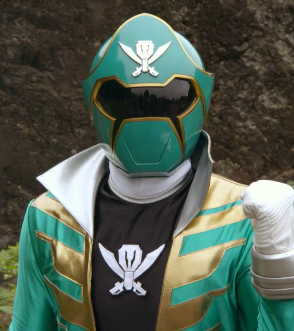
i couldn't find any material directly from Toei that describes Kamen Rider Birth with any particular color term, but thankfully, i don't have to, because thanks to Super Sentai, we have an incredibly robust portfolio of suits they absolutely label as green. i'm not going to go through the trouble of doing this same averaging technique on the 30-ish green rangers; part of that is a self-defense mechanism for my own sanity, but part of it is also that i landed the ultimate hole-in-one while searching for a basic comparison point. i grabbed a screenshot of Gokai Green, from Kaizoku Sentai Gokaiger (which was produced and aired right alongside Kamen Rider OOO), and taking a color sample from his helmet gave me a hexcode of #2b7e6b... which happens to have the exact same hue value as our averaged color taken from Kamen Rider Birth's helmet, at 166 degrees on the color wheel.
running down a list of other green rangers, ranging from a few years before OOO all the way into the 2020s, produced similar results. many had a hue that was within a handful of degrees of our Birth color average, and surprisingly, three of them actually skewed even closer towards blue on the color wheel, with the greatest outlier being Kyoryuger's Kyoryu Green at a whopping 12 degrees 'bluer'.
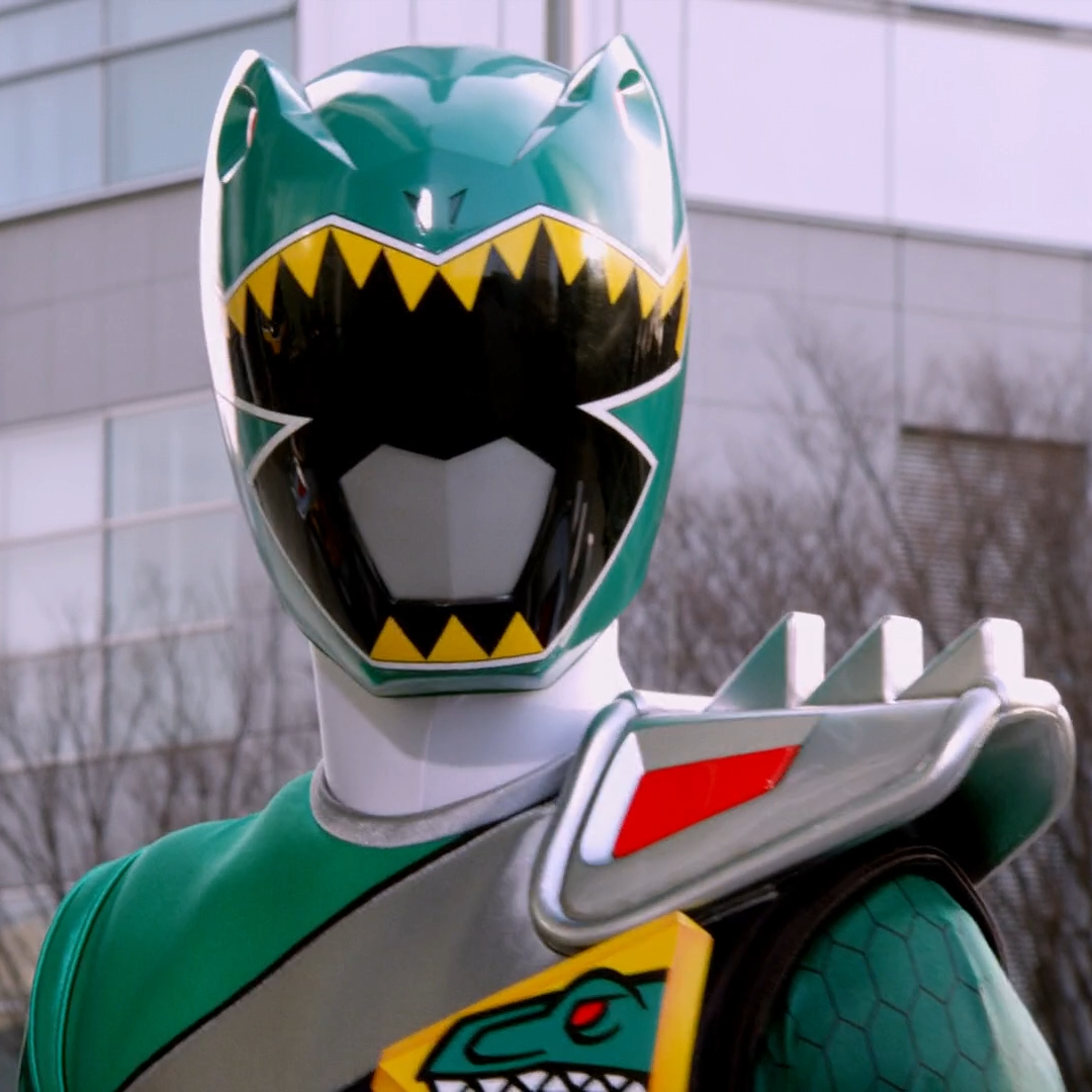 these are all characters with "green" literally in their ranger title! what we can clearly extrapolate from this is that within either Toei or their suit manufacturing partners at PLEX, there is some kind of standardized tone they call green that i would call teal.
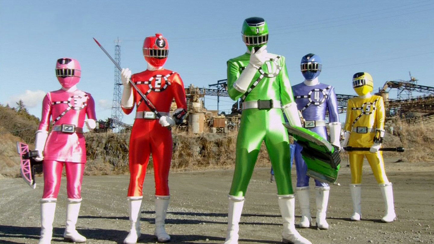
what makes this all the more interesting to me is that, for a brief window between 2014 and 2017, Toei "fixed" this problem; at least, insomuch as you can "fix" a subjective descriptive label for color based on my own personal metrics. the factual baseline here is that the green rangers introduced from Ressha Sentai ToQger to Uchuu Sentai Kyuranger are all a very different shade of green than the otherwise 'standard' green we've been examining, straying almost 60 degrees away from our established baseline. i happen to think this color looks both remarkably nicer for the monochromatic needs of Super Sentai, and closer to what i would actually call green. green, like the grass i'll need to go touch after staring at pictures of Kamen Rider Birth all day.
if i had to speculate on why Toei's definition of green is like that, and why it might have shifted back after a few years of experimenting with a new hue, one of the first things that comes to mind is how color interacts with the filmmaking process. clearly it's not impossible to isolate either of these shades against a greenscreen if you really want to, given they've done it for years, but maybe Toei and PLEX have determined that this particular color is easiest to manage when dealing with chroma keys and the like, especially when you're filming multiple weekly television series under a genre that's literally defined by its special effects. it's also probably worth pointing out that green has become an increasingly uncommon color within Super Sentai lineups over the past few years, which lines up with Toei starting to utilize more elaborate greenscreen set-ups and even Disney-style LED screen backdrops; workflows change, and the design process behind tokusatsu is constantly in conversation with those changes.
there's another reason that comes to mind, though, and while it might be the most intriguing possibility to me, it's also the one where i am extremely out of my depth. i'm citing both other sources who know a lot more about these things than me, and speculating about an already subjective linguistic subject with the added difficulty of a language barrier, so consider this next stretch less of a qualified description and more of a genuine off-ramp into "i wonder if this has anything to do with what's going on here".
there's a linguistic concept that, in English, is sometimes referred to as "grue"; if you want a more thorough primer on the concept from someone who knows what they're saying, i would recommend Tom Scott's video on the subject, although even that also leads upwards into a chain of further expertise. to try and sum up the relevant information in my own words, different languages have different terminology for colors, and those terms don't all enter the lexicon fully formed at the same time. one of the most common areas where this type of distinction varies wildly is in drawing the line between green and blue, with many languages historically only having a single word for that entire chunk of the color spectrum.
i do want to tread carefully here and stress that i'm not fluent in modern Japanese, let alone historical uses of the language dating back centuries, but from what i can gather, it does seem like there's at least some wiggle room within the Japanese lexicon about this distinction. in the most extraordinarily simplified sense, Japanese has a word for blue (青, ao) and green (緑, midori), and we see that play out whenever Super Sentai uses these names instead of English loan words; the original Himitsu Sentai Gorenger has a blue Aorenger and a green Midorenger. easy!
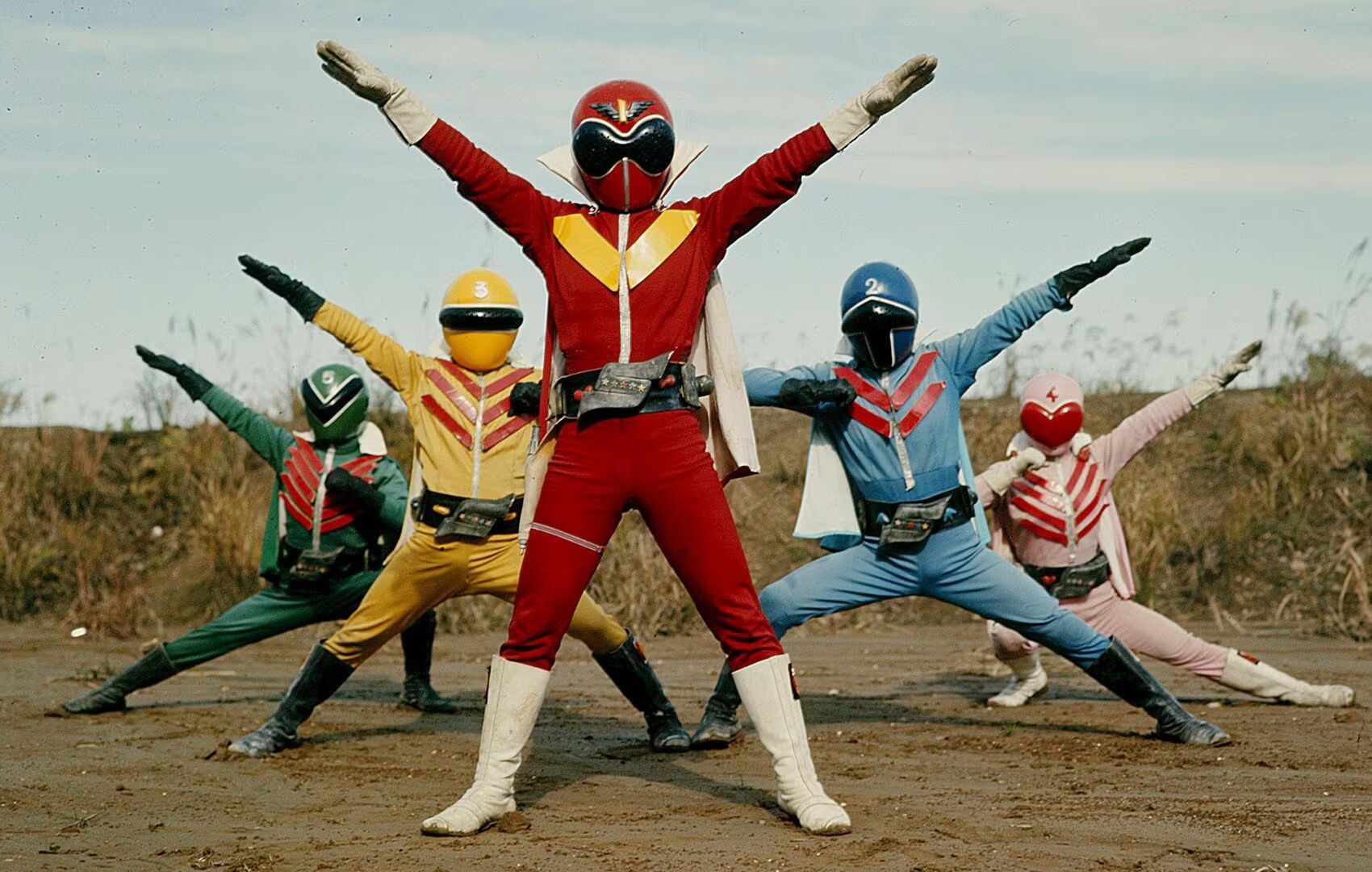
only it's not so easy. a lot of shallow surface-level analysis claims that midori basically didn't exist until the mid-20th century, a few research papers i found push back on this by pointing out midori is used in all kinds of weird, blurry contexts dating back to the oldest surviving Japanese writing from 750 AD, but the point is this; for some significant amount of the history of the Japanese language, ao and midori were both used in ways that could refer to both blue and green, depending on the context they were being used in. for whatever reason, it's the ao part that a lot of Western sources seem to really latch onto, but actual language studies seem to paint it as a much more nuanced spectrum, so for the purposes of where i'm going with this, let's just say there was some historical ambiguity that still has a few key influences on modern Japanese linguistics.
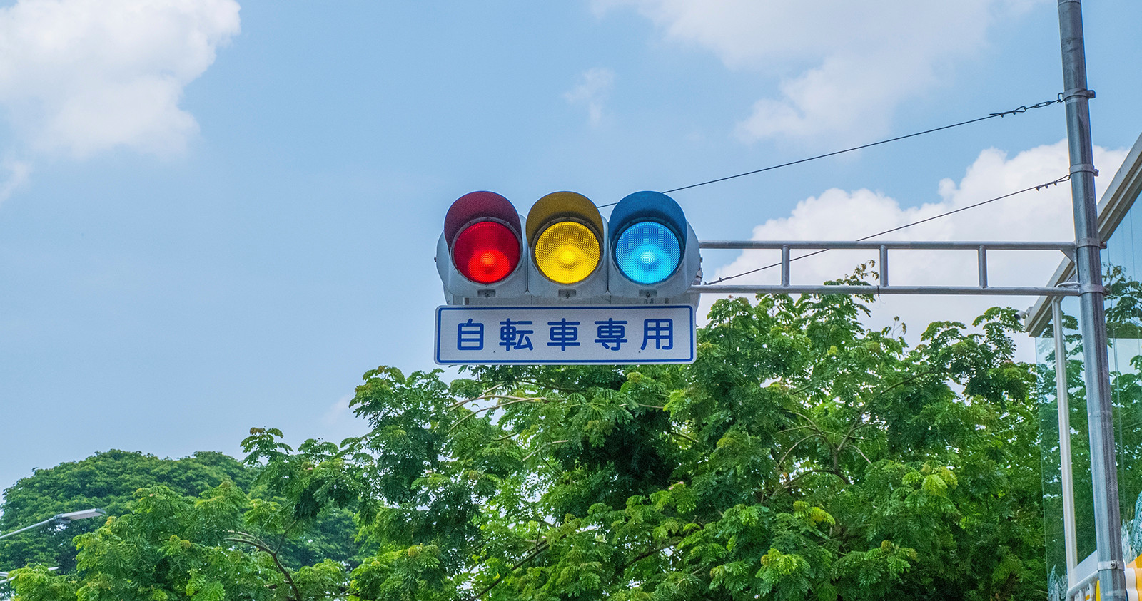
while ao and midori in the modern sense map much more directly onto a separation of color groups that English uses, there are still exceptions to this rule where ao is used to refer to something green. a lot of these cases seem to have to do with vegetation, but one of the more high-profile examples of this is traffic lights. as best as i can tell, the history goes like this; when traffic lights became a necessary part of infrastructure in the 1930s, Japan used the same set of colors we used in America, with red, yellow, and green. however, in an official sense - as in, educating drivers about what each light means, and making sure they can distinguish the colors as part of their driving test - the green light was referred to with ao. evidently, this in turn influenced the people manufacturing the traffic lights, because to this day, you can find older installations like the one pictured above, that have very unambiguously blue lights.
as time went on, international standards for transit safety became more and more of a thing to make sure that travelers could understand the rules of the road wherever they were. Japan didn't sign on to the Vienna Convention on Road Signs and Signals (although, to be clear, neither did America, for some reason?), but they did decide to implement their own workaround, which is honestly kind of hilarious in terms of its specifity. in 1973, the Japanese government officially decreed that the new standard for traffic lights would be, and this is the English phrasing on every source i could find for this, "the bluest shade of green possible". international travelers can look at a Japanese traffic light and understand when they're being told to go, while the government carves out an extraordinarily pedantic bit of plausible deniablity that lets them keep referring to the light as ao in every official way that matters. everyone wins!
and, to loop this back around to Toei and Kamen Rider, this type of linguistic ambiguity is why, while an international fan like me might be primed to joke about OOO's TaToBa combo looking like a traffic light, the trailer for the back-to-back-to-back Cho Den-O Trilogy features Momotaros quipping about how the trilogy's red, yellow, and blue 'episodes' are like a traffic light. this remnant of how the color terms have shifted over centuries is still absolutely a part of the way the Japanese language is used in modern times.
so, then, what does all that have to do with determining what color Kamen Rider Birth is? well, it depends on how much you think language and perception impact each other. that 1973 decree about making sure the green was as blue as possible happens to be right between the debuts of Kamen Rider and Super Sentai. for the people working on these shows, creating tokusatsu history and setting the precedent for things like 'what does the green ranger look like', the lexical ambiguity between ao and midori was prevalent enough in living memory that the government was still having to create solutions for things way more important than suit design, like, y'know, traffic safety. perhaps the modern Toei green looks so teal to me in part because the distinction just wasn't as prevalent for the artists who set the standard?
there are major, major holes in this line of thinking that are probably worth pointing out. for starters, the first few years of Super Sentai suits used a very different set of materials, with cloth jumpsuits and a color palette that includes a much more unambiguous green; the first example i can solidly pin down of a suit that uses modern-ish materials and displays that much more ambiguous teal tone is 1988's Choju Sentai Liveman,
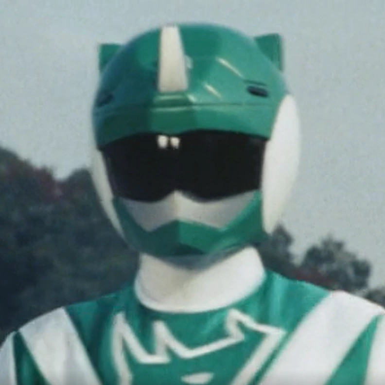 and we're really starting to stretch the thread thin between these two pins on the board if we're saying traffic light ambiguity has anything to do with tokusatsu production 15 years later.
on a note that i feel more of an ethical responsibilty to stress, Japan is not some mythical realm, it is a real country full of real people, and Japanese is not some indecipherable set of runes, it's a language with a history ranging from 'before we had English all the way figured out' to 'right fucking now'. i'm writing this as someone who doesn't speak the language, largely because "i think Toei's go-to green tone looks a little blue-ish to me" and "hey, there's that weird fact about Japanese traffic lights" are two things i had bouncing around in my head that might be, at best, tangentially related. even if i were somehow spot-on about this, it wouldn't mean the Japanese language is wrong, it just means there's some interesting psychological factors at play about how categorization and language overlap with real-world perception, and my categorization is just different from someone else's.
indeed, if the terrible self-indulgent spirit that haunts my brain worms its way back in and has me revisit this subject, i think the main way i'd like to go bigger is just to get in touch with someone who does speak fluent Japanese and try to do some internet sleuthing to see how Kamen Rider fans in Japan talk about the Birth suit, both now and as the show was airing in the early 2010s. just like with English, there's plenty of Japanese words that describe all sorts of things between green and blue, not to mention getting all non-literal and describing the color through comparison or metaphor. who knows? maybe there's someone out there, 15 years ago and an entire ocean away, getting just as pedantic as i am about what color term is best suited for Kamen Rider Birth.
i also can't end this piece without pointing out that color is wildly, notoriously subjective on dozens of layers. somewhere out there - probably in deep storage, as i write this - there are real-ass Kamen Rider Birth suits produced by PLEX and Toei. those suits have a color. the color we've been talking about is the wavelength that the cone cells in my retinas receive and convert into a mental image of color when looking at footage or pictures of Kamen Rider Birth; frames and photos that have, in turn, gone through at least one if not several layers of digital image compression. all of these compressed images are even further shifted by outside forces, whether that's intentional color grading as part of the filmmaking process, unintentional factors created by the realities of light hitting a physical object, or the way the colors around a given object can alter our perception of its color. before any of this information can even reach my eyes, they pass through a screen that might be calibrated differently from yours. ceci n'est pas une Kamen Rider Birth, if you will.
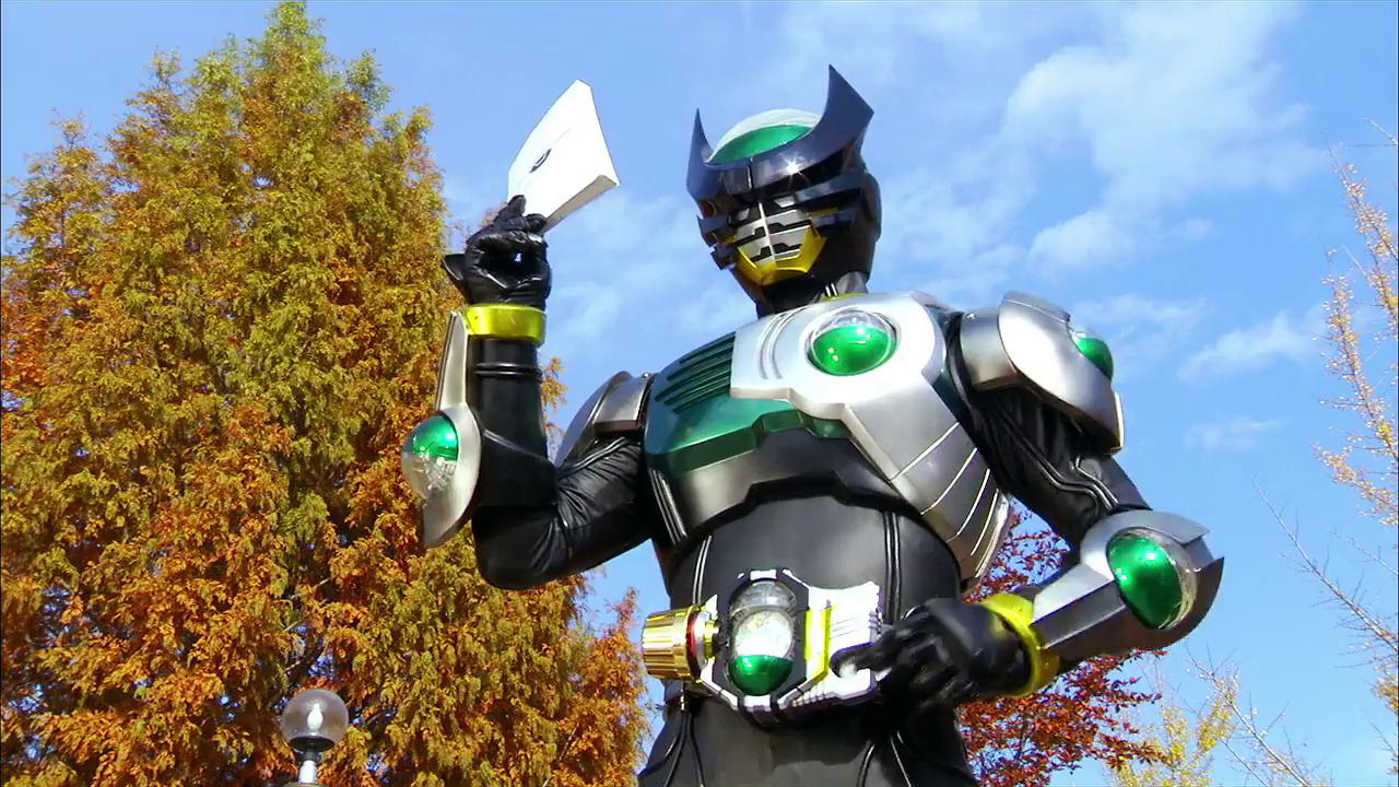
do i have a point to having written all this? not especially. i can tell you what color i personally think Kamen Rider Birth is, in the sense that i can pin down a word that i would use to describe the suit, both from personal memory and scientific sampling. maybe he really is just green though, hell if i know. if nothing else, i hope reading all this might at least get you thinking about things like your own personal perception of color, or how linguistics and biological stimuli and filmmaking all form this weird tangled mesh underpinning the simple joy of watching a dude dropkick a monster on a television series that barely even makes it to English-speaking countries. next time you stop and go "what color is that thing, really?", admire the internal and external complexities that inform how you might answer.
unless you're at a traffic light. they want you to go, probably. bluest shade of green possible and all that. safety first.

